Glossary page B
Bar graph
There are two uses of bar graphs.
First, a graph for displaying the distribution of a category variable or whole-number variable in which equal-width bars represent each category or value. The length of each bar represents the frequency (or relative frequency) of each category or value. See Example 1 below.
Second, a graph for displaying bivariate data: one category variable and one numerical variable. Equal-width bars represent each category, with the length of each bar representing the value of the numerical variable for each category. See Example 2 below.
The bars may be drawn horizontally or vertically.
Bar graphs of the first type are useful for showing differences in frequency (or relative frequency) among categories, and bar graphs of the second type are useful for showing differences in the values of the numerical variable among categories.
For category data in which the categories do not have a natural ordering, it may be desirable to order the categories from most to least frequent or greatest to least value of the numerical variable.
Example 1
The number of days in a week that rain fell in Grey Lynn, Auckland, from Monday 2 January 2006 to Sunday 31 December 2006 is displayed on the bar graph below.

If you cannot view or read this diagram/graph, select this link to
open a text version.
Example 2
World gold mine production for 2003 by country, based on official exports, is displayed on the bar graph below.

If you cannot view or read this diagram/graph, select this link to
open a text version.
Alternatives: bar chart, bar plot, column graph (if the bars are vertical)
Curriculum achievement objectives references
Statistical investigation: Levels (2), (3), (4), (5), (6), (7), (8)
Bias
An influence that leads to results that are systematically less than (or greater than) the true value. For example, a biased sample is one in which the method used to create the sample would produce samples that are systematically unrepresentative of the population.
Note that random sampling can also produce an unrepresentative sample. This is not an example of bias because the random sampling process does not systematically produce unrepresentative samples and, if the process were repeated many times, the samples would balance out on average.
Curriculum achievement objectives references
Statistical investigation: Levels (5), (6), (7), (8)
Binomial distribution
A family of theoretical probability distributions, members of which may be useful as a model for some discrete random variables. Each distribution in this family gives the probability of obtaining a specified number of successes in a specified number of trials, under the following conditions:
- The number of trials, n, is fixed
- The trials are independent of each other
- Each trial has two outcomes; ‘success’ and ‘failure’
- The probability of success in a trial,
 , is the same in each trial.
A discrete random variable arising from a situation that closely matches the above conditions can be modelled by a binomial distribution.
Each member of this family of distributions is uniquely identified by specifying n and
. As such, n and
, are the parameters of the binomial distribution and the distribution is sometimes written as binomial(n,
).
Let random variableX represent the number of successes in n trials that satisfy the conditions stated above. The probability of x successes in n trials is calculated by:

If you cannot view or read this formula, select this link to
open a text version.
where
 is the number of combinations of n objects taken x at a time.
If you cannot view or read this formula, select this link to
open a text version.
Example
A graph of the probability function for the binomial distribution with n = 6 and
= 0.4 is shown below.

If you cannot view or read this diagram/graph, select this link to
open a text version.
Curriculum achievement objectives reference
Probability: Level 8
Bivariate data
A pair of variables from a data set with at least two variables.
Example
Consider a data set consisting of the heights, ages, genders, and eye colours of a class of year 9 students. The two variables from the data set could be:
- both numerical (height and age),
- both category (gender and eye colour)
- one numerical and one category (height and gender, respectively).
Note: Part of a Level 8 achievement objective states ‘including linear regression for bivariate data’. This use of bivariate data implies that both variables are numerical (i.e., quantitative variables).
Curriculum achievement objectives references
Statistical investigation: Levels (3), (4), (5), (6), (7), 8
Bootstrap confidence interval
An interval estimate of a population parameter formed using bootstrapping.
Example
The lengths (in mm) of a sample of 25 horse mussels from a site in the Marlborough Sounds are: 200, 222, 225, 196, 188, 205, 208, 225, 197, 188, 214, 204, 224, 215, 224, 228, 208, 197, 197, 198, 229, 233, 228, 170, 217
Assume this is a random sample of horse mussels from this site. This sample will be used to estimate the mean length of the population of horse mussels from this site. The ‘bootstrap confidence intervals’ module from the
iNZightVIT software produced the following output.
If you cannot view or read this diagram/graph, select this link to
open a text version.
The bootstrap confidence interval for the mean of this population is (203.56mm, 215.52mm).
Interpretation of the bootstrap confidence interval: It is a fairly safe bet that the mean length of the population of horse mussels from this site in the Marlborough Sounds is somewhere between 203.6mm and 215.5mm.
Note: There was no special reason for choosing a bootstrap confidence interval for the mean; a bootstrap confidence interval for the median of this population could have been chosen.
See: bootstrapping
Curriculum achievement objectives reference
Statistical investigation: (Level 8)
Bootstrap distribution
The distribution of the statistics or estimates calculated from resamples, using bootstrapping, from the original sample.
Example
The lengths (in mm) of a sample of 25 horse mussels from a site in the Marlborough Sounds are: 200, 222, 225, 196, 188, 205, 208, 225, 197, 188, 214, 204, 224, 215, 224, 228, 208, 197, 197, 198, 229, 233, 228, 170, 217
Assume this is a random sample of horse mussels from this site. This sample will be used to produce a bootstrap confidence interval for the mean length of the population of horse mussels from this site. The ‘bootstrap confidence intervals’ module from the
iNZightVIT software produced the following output.
If you cannot view or read this diagram/graph, select this link to
open a text version.
The bootstrap distribution is made up of the means of 1000 resamples, using bootstrapping, taken from the original sample.
Note: There was no special reason for choosing a bootstrap confidence interval for the mean; a bootstrap confidence interval for the median of this population could have been chosen. If this was the case then the bootstrap distribution would have been made up of the medians of 1000 resamples.
See: bootstrapping, bootstrap confidence interval
Curriculum achievement objectives references
Statistical investigation: (Level 8)
Bootstrapping
A resampling method used to form an interval estimate of a population parameter. The method involves:
- Randomly sampling, with replacement, from the original sample until the resample size equals the original sample size
- Calculating an estimate of the population parameter (or statistic) from the resample
- Forming many resamples (1000 resamples is common)
- Using the distribution of estimates (or statistics) from the resamples to produce an interval estimate for the population parameter. The interval spanning the central 95% of the estimates is commonly used to produce the interval estimate.
The interval estimate is called a bootstrap confidence interval.
A strength of bootstrapping is that it can be used to estimate a range of parameters such as means, medians, proportions, quartiles (including differences for two different populations).
Important note: The confidence level associated with the process of forming a bootstrap confidence interval for a parameter cannot be determined accurately but, in most cases, the confidence level will be about 90% or higher (especially if any samples used are quite large). That is, just because the central 95% of estimates was used to form the confidence we cannot say that the confidence level is 95%.
Note: There are several different methods of forming a bootstrap confidence interval from the distribution of estimates from resamples. The method described above is the method suggested for use at Level 8 of the New Zealand Curriculum and the interval produced is often called a percentile bootstrap confidence interval.
Alternative: bootstrap method
See: bootstrap confidence interval, bootstrap distribution
Curriculum achievement objectives reference
Statistical investigation: (Level 8)
Box and whisker plot
A graph for displaying the distribution of a numerical variable, usually a measurement variable.
Box and whisker plots are drawn in several different forms. All of them have a ‘box’ that extends from the lower quartile to the upper quartile, with a line or other marker drawn at the median. In the simplest form, one whisker is drawn from the upper quartile to the maximum value and the other whisker is drawn from the lower quartile to the minimum value.
Box and whisker plots are particularly useful for comparing the distribution of a numerical variable for two or more categories of a category variable by displaying side-by-side box and whisker plots on the same scale. Box and whisker plots are particularly useful when the number of values to be plotted is reasonably large.
Box and whisker plots may be drawn horizontally or vertically.
Example
The actual weights of random samples of 50 male and 50 female students enrolled in an introductory statistics course at the University of Auckland are displayed on the box and whisker plot below.
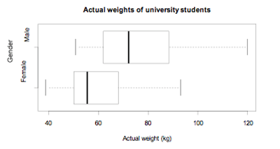
If you cannot view or read this diagram/graph, select this link to
open a text version.
Alternatives: box and whisker diagram, box and whisker graph, box plot
Curriculum achievement objectives references
Statistical investigation: Levels (5), (6), (7), (8)
Last updated October 9, 2013
TOP

