Glossary page T
Tally chart
A table used to record values for a variable in a data set, by hand, often as the values are collected. One tally mark is used for each occurrence of a value. Tally marks are usually grouped in sets of five to aid the counting of the frequency for each value.
A tally chart provides an immediate visual form of the distribution.
Example
The number of days in a week that rain fell in Grey Lynn, Auckland, from Monday 2 January 2006 to Sunday 31 December 2006 is recorded in the tally chart below.
Tally of weeks by number of days with rain.
| 0
| ||
|
| 1
| |||||
|
| 2
| |||||
|
| 3
| |||||
|
| 4
| ||||| ||||| ||||| ||||
|
| 5
| ||||| |
|
| 6
| ||||| |
|
| 7
| ||||
|
The tally chart can then be re-drawn as the following frequency table.
Count of weeks by number of days with rain.
| 0
| 2
|
| 1
| 5
|
| 2
| 5
|
| 3
| 5
|
| 4
| 19
|
| 5
| 6
|
| 6
| 6
|
| 7
| 4
|
| Total
| 52
|
Curriculum achievement objectives references
Statistical investigation: Levels (1), (2), (3), (4), (5), (6)
Theoretical probability
The probability that an event will occur based on a probability model. A theoretical probability gives an estimate of the true probability but its usefulness as an estimate depends on how well the model matches the situation being modelled.
Alternative: model probability
Curriculum achievement objectives references
Probability: Levels 5, 6, 7, 8
Theoretical probability distribution
A model for the variation in the values of a variable based on defining the probabilities of values of a variable.
For a whole-number variable or a discrete variable, a theoretical probability distribution may be:
- displayed in a table, as a set of values and their corresponding theoretical probabilities (or model probabilities),
- displayed in a bar graph (with lengths of bars representing individual theoretical probabilities), or
- represented by a mathematical function (a probability function).
For a continuous variable, a theoretical probability distribution is described by a probability density function and may be represented by a mathematical function or displayed as a graph.
Example 1 (for a whole-number variable)
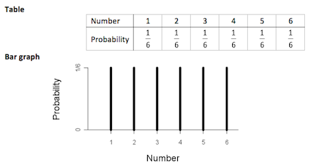
A theoretical probability distribution for rolling a fair, six-faced die may be represented as follows:
If you cannot view or read this diagram/graph, select this link to
open a text version.
Mathematical function
P(X = x) = 1/6 for x = 1, 2, 3, 4, 5, 6
This model assumes that each roll is independent of all other rolls and that the probability of each number facing upwards is the same for each roll.
Example 2 (for a discrete variable, Level 8)
In a large manufacturing company the mean number of people who are absent per day because of illness is 3.6. A Poisson distribution with a mean of 3.6 may be used as a theoretical probability distribution if the conditions of the situation are similar to the conditions required for a Poisson distribution.
Let random variableX represent the number of people absent on a day. The probability of x people being absent on a day is modelled by:
P(X = x) =
 for x = 0, 1, 2, ...
Example 3 (for a continuous variable, Level 7 or 8)
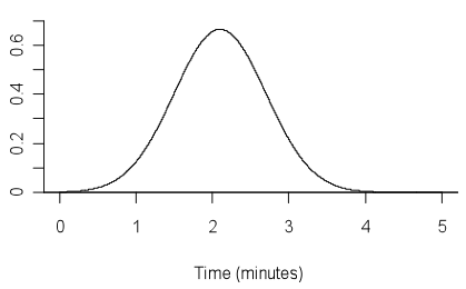
In a fitness task, the time (in minutes) that a person can balance on one leg may be modelled by a normal distribution with an appropriate mean and standard deviation. Suppose that a mean of 2.1 and standard deviation of 0.6 is appropriate.
Let random variable X represent the time, in minutes, that a person can balance on one leg. The graph below shows the probability density function of X.

If you cannot view or read this diagram/graph, select this link to
open a text version.
Alternative: probability model
See: binomial distribution, distribution, normal distribution, Poisson distribution, triangular distribution, uniform distribution
Curriculum achievement objectives references
Statistical investigation: (Level 8)
Probability: Levels 5, 6, 7, (8)
Time-series data
A data set gathered over time. For one object, such as climate in Rolleston, Canterbury, the values of a variable (or several variables) are obtained at successive times. Usually there are equal intervals between the successive times.
Example
The maximum temperature, rainfall, maximum atmospheric pressure, and maximum wind gust speed recorded daily in Rolleston.
Note: At Level Eight, a common approach to modelling time-series data considers the data to have four components: trend component, cyclical component, seasonal component, and irregular component.
See: additive model (for time-series data)
Curriculum achievement objectives references
Statistical investigation: Levels 3, 4, (5), (6), (7), 8
Treatment
In an experiment, the value of the explanatory variable that is chosen by the researcher to be given to each individual in a group.
See: experiment
Curriculum achievement objectives references
Statistical investigation: Levels (7), (8)
Statistical literacy: Level (8)
Tree diagram
A diagram used to represent the possible outcomes in a probability activity that has more than one stage.
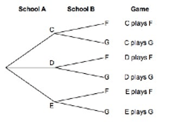
From a single starting point, a branch is drawn to represent the outcomes of the first stage. From the end of each branch, a second branch is drawn to represent the outcomes of the second stage, and so on. From the starting point, each path through the tree represents an outcome of the whole activity.
A tree diagram can be a useful tool for obtaining a systematic list of all the possible outcomes of a probability activity that involves two or three stages (see Example 1). The use of tree diagrams is usually restricted to two-stage or three-stage probability activities because they become too complicated when the total number of outcomes is large.
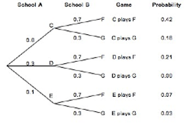
If the outcomes at each stage are not equally likely to occur then, for each stage, the probability of each outcome for each stage is written on a branch.
Example 1 (outcomes only, no probabilities on branches)
In a game of tennis, one player from School A is to play one player from School B. School A has 3 players to choose from (C, D, and E) and School B has 2 players to choose from (F and G). If each player has an equal chance of being selected to play for their school, list all the possible combinations of games.

If you cannot view or read this diagram, select this link to
open a text version.
Example 2 (independent stages, probabilities on branches)
In a game of tennis, one player from School A is to play one player from School B. School A has 3 players to choose from (C, D, and E) and School B has 2 players to choose from (F and G). For School A, the probabilities of C, D, or E being selected are 0.6, 0.3, and 0.1 respectively. For School B, the probabilities of F or G being selected are 0.7 and 0.3 respectively. List all the possible combinations of games with their probabilities. Assume that choosing a player from School A is independent of choosing a player from School B.

If you cannot view or read this diagram, select this link to
open a text version.
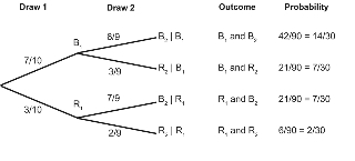
Example 3 (conditional stages, probabilities on branches)
A jar contains 10 balls, 7 are blue and 3 are red. A ball is randomly taken from the jar, and its colour is noted. The ball is not placed back in the jar, and a second ball is randomly taken from the jar. List all the possible outcomes of this probability activity with their probabilities.

If you cannot view or read this diagram, select this link to
open a text version.
Curriculum achievement objectives references
Probability: Levels 7, (8)
Trend
A general tendency among variables in a data set, usually between pairs of variables.
For two numerical variables, as values of one variable increase, the trend is any general tendency of the change in the values of the other variable. See Example 1 below.
For two category variables, both of which have a natural ordering of their categories, as transitions are made from the lowest to the highest category, the trend is any general tendency of the changes in the categories of the other variable. See Example 2 below.
For a category variable that has a natural ordering of its categories and a numerical variable, as transitions are made from the lowest to the highest category for the category variable, the trend is any general tendency of the changes in the values of the numerical variable. See Example 3 below.
For time-series data, the trend is any general tendency to change with time. See Example 4 below.
Example 1 (two numerical variables)
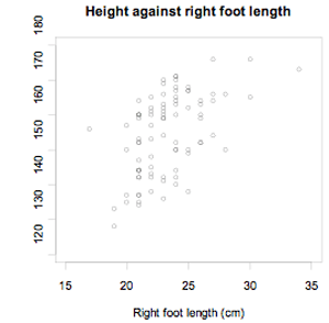
Data were selected for 86 New Zealand school students from the CensusAtSchool website. The scatter plot below displays the data for their height and right foot length, both in centimetres.

If you cannot view or read this graph, select this link to
open a text version.
As the length of the right foot increases, there is a general tendency for height to increase. The trend is that, generally, an increase is right foot length is associated with an increase in height.
Example 2 (two category variables with a natural ordering of categories)
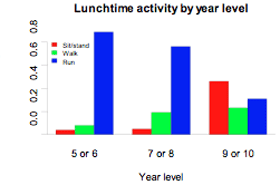
Data were selected for 86 New Zealand school students from the CensusAtSchool website. Two of the variables were their year level (5 or 6, 7 or 8, 9 or 10) and their usual level of lunchtime activity (sit or stand, walk, run). The data are displayed in the two-way table and bar graph below. The table shows frequencies for each cell, as well as row proportions for each of the three groups of year levels.
Two way table of Lunchtime activity by Year level.
| Year level
| Sit or stand
| Walk
| Run
| Total
|
| 5 or 6
| 1
| 2
| 23
| 26
|
| (3.8%)
| (7.7%)
| (88.5%)
|
|
| 7 or 8
| 1
| 4
| 16
| 21
|
| (4.8%)
| (19.0%)
| (76.2%)
|
|
| 9 or 10
| 18
| 9
| 12
| 39
|
| (46.2%)
| (23.1%)
| (30.8%)
|
|
| Total
| 20
| 15
| 51
| 86
|

If you cannot view or read this graph, select this link to
open a text version.
As we move from year levels 5 or 6 to year levels 9 or 10, there is a general tendency for the proportion running during lunchtime to decrease and the proportion sitting or standing to increase. The trend is that for higher year levels, generally, there is an increase in less vigorous forms of lunchtime activity.
Example 3 (one numerical variable and one category variable with a natural ordering of categories)
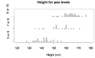
Data were selected for 86 New Zealand school students from the CensusAtSchool website. The dot plot below displays the data for their heights, in centimetres, for three groups of year levels.

If you cannot view or read this graph, select this link to
open a text version.
As we move from year levels 5 or 6 to year levels 9 or 10, there is a general tendency for height to increase. The trend is for students at higher year levels to be taller, in general.
Example 4 (time-series data)
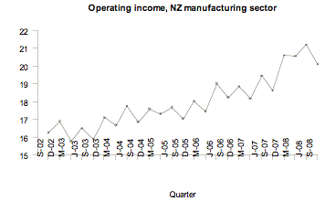
Statistics New Zealand’s Economic Survey of Manufacturing provided the following data on actual operating income for the manufacturing sector in New Zealand for each quarter from September 2002 to September 2008. Note that M, J, S, and D indicate quarter years ending in March, June, September, and December respectively.

If you cannot view or read this graph, select this link to
open a text version.
Over time, there is a general tendency for the operating income to increase. The trend is that as time goes by, generally, there is an increase in operating income.
Curriculum achievement objectives references
Statistical investigation: Levels 3, 4, 5, 6, (7), (8)
Trend component (for time-series data)
The general tendency in time-series data. The trend component is the slow variation in the time series over a long period of time, relative to the interval between the successive times.
See: time-series data
Curriculum achievement objectives reference
Statistical investigation: Level (8)
Triangular distribution
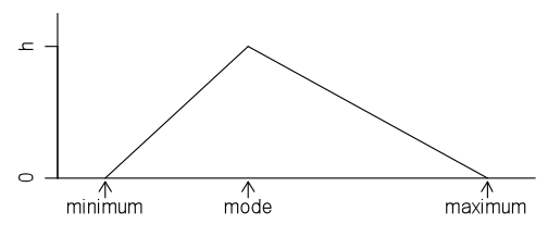
A family of theoretical probability distributions, members of which may be useful as a model for some continuous random variables. A continuous random variable arising from a situation that produces values where the minimum, maximum and mode are known (or can be estimated with reasonable precision) can be modelled with a triangular distribution with the following probability density function:

If you cannot view or read this diagram/graph, select this link to
open a text version.
In the above graph the value of h, the y-coordinate of the apex of the triangle, will depend on the values of the minimum and maximum. Recall that the area under a probability density function is 1.
The name of the distribution comes from the triangular shape of the probability density function.
The triangular distribution is often used as an alternative to the normal distribution when it is known that the distribution is not symmetrical.
Note: In a graph of a probability function for a discrete random variable, if the tops of the bars form a triangle then the associated distribution may be called a discrete triangular distribution.
Example
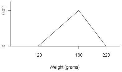
A market gardener grows a variety a tomatoes and from previous experience of weighing tomatoes it is estimated that the minimum weight is about 120g, the maximum weight is about 220g and the mode is about 180g. The following triangular distribution can be used as a model for the weights of tomatoes produced by this gardener.

If you cannot view or read this diagram/graph, select this link to
open a text version.
This model assumes that as weight increases from 120g to 180g, there is a constant increase in the proportion of tomatoes, and as weight decreases from 180g to 220g, there is a constant decrease in the proportion of tomatoes.
Curriculum achievement objectives reference
Probability: (Level 8)
True probability
The actual probability that an event will occur. The true probability is usually unknown and may be estimated by a theoretical probability from a probability model or by an experimental estimate of a probability.
Curriculum achievement objectives references
Probability: Levels (5), (6), (7), (8)
Two-way table
A table in which the rows represent the categories for one category variable, the columns represent the categories of a second category variable, and each cell displays the frequency (or proportion) resulting for that row and column combination for the two variables.
Example
Data were collected from answers to an online questionnaire from 727 students enrolled in an introductory statistics course at the University of Auckland. Two of the variables of interest are the gender of the students and the course in which they were enrolled (STATS 101, STATS 102, or STATS 108). The following two-way table was formed by counting the number of students falling into each combination of categories of the two variables.
Two-way table of Course by Gender.
|
|
| 101
| 102
| 108
| Total
|
| Gender
| Female
| 218
| 50
| 157
| 425
|
| Male
| 141
| 18
| 143
| 302
|
|
| Total
| 359
| 68
| 300
| 727
|
Alternative: contingency table
Curriculum achievement objectives references
Probability: Levels 7, (8)
Last updated October 17, 2013
TOP


 for x = 0, 1, 2, ...